This is the final product for our Film Opening, although when exporting I had some technical difficulties and the original (edited) files disappeared. Therefore, the scene such as the running part where the protagonist is running away it was supposed to be drastically darker in the surroundings to make it more futuristic making it seems like the floor is floating. But all in all the final product is up and out.
Sunday, 20 March 2016
Saturday, 27 February 2016
Evaluation 2 - Representation
Portraying the Main character was fairly straightforward for us, as we wanted to audience to interpret the main character as someone with an ambiguous background.
The age of the character is supposedly close to our target audience, so around 16 to 20. The ethnicity of the protagonist is left ambiguous in order to allow for a wider possible association.

The protagonist running is a portrayal of running away from our own problems.
The sounds we made and used were there to establish the sense of something that is not human, but machine. This raises the theme of human and machine combining, as that is what happening to the main character.
Dream Casting
Alicia Vikander to play as the main character (protagonist). She is the main character in Ex Machina, therefore I think that she would fit the character of my vision and the typical character that would play for a "sci-fy thriller". Which would be the delicate features of her face and having brown hair/black.
ISSUES
The protagonist for our opening is a material representation, a trope, for the struggles and inner conflicts that humans face, particularly teenagers and young adults. She addresses the question of identity, and learning about yourself as a person. Many teenagers would be able to relate to this, as this is a inner conflict that many of them might've faced.
The age of the character is supposedly close to our target audience, so around 16 to 20. The ethnicity of the protagonist is left ambiguous in order to allow for a wider possible association.

The protagonist running is a portrayal of running away from our own problems.
The sounds we made and used were there to establish the sense of something that is not human, but machine. This raises the theme of human and machine combining, as that is what happening to the main character.
Dream Casting
Alicia Vikander to play as the main character (protagonist). She is the main character in Ex Machina, therefore I think that she would fit the character of my vision and the typical character that would play for a "sci-fy thriller". Which would be the delicate features of her face and having brown hair/black.
ISSUES
The protagonist for our opening is a material representation, a trope, for the struggles and inner conflicts that humans face, particularly teenagers and young adults. She addresses the question of identity, and learning about yourself as a person. Many teenagers would be able to relate to this, as this is a inner conflict that many of them might've faced.
Friday, 26 February 2016
Evaluation 3 Audience
My target audience includes both males and females aged 16 to 20. This was because the film features a female protagonist, which would allow the female audience create an easy-to-grasp connection. For the male audience, we wanted to attract them through the film revolving around machinery, and carrying the theme of futuristic sci-fi, similar to many video games of the likes of Crisis, Deus Ex etc. that seem popular among males.
The reason for the age group is because towards the younger audiences in this age range are at the stage of life of finding out about themselves. The film and the film opening holds the theme of identity, which would allow for associations with the audience.
The use of animation was involved a lot throughout the film opening, although because we didn't have a lot of time to spare we decided that mixing the 'real' footage with the animated (CGI) is easier and less time consuming but still be able to give off that look that it's in the "future". The size of the footage was also taken to consideration, instead of making it full screen which is 1080/1920 I suggested to the group that we change it to 1080/816 therefore, the footage will look cinematic. On the other hand the colour palette of the film was also a main thing. If it was in "normal" colours it wouldn't look as futuristic because the shots/scenes are from the present so we made the colour scheme more towards the cool colour (greenish blue). With some footage, for example where the potagonist is running away the background was a pavement and on the side there were grass, which doesn't fit the whole future theme because you wouldn't really be expecting loads of trees in a very futuristic world do you? So then I needed to mask all of the grass out and feather it so that it looks like the pavement is floating.
Please read the annotations
Thursday, 25 February 2016
Evaluation 4 - Distribution
Our opening would be distributed as a real media text by focusing on a niche audience which in our case would be aiming towards the people who are interested in the idea of the futuristic style, living and human evaluation by adding robotic parts that makes human stronger and able to live longer.
It would be released during the month of January.
Firstly it'll be released in the cinema, however before that, there will be trailers, teasers and little snippets of what is to be expected so that the audience that we are aiming for know of the movie. Maybe including a 2nd-3rd trailer revealing new character(s) that was not shown in the 1st trailer. To get the audience hyped up about the movie and giving time for the news to go through social networks, gaining a bigger audience that is interested in the movie and it will reach across the niche market customers that we are aiming for. Which is people who is into Sci-fy, futuristic world/life style and human evaluation. It will probably be on Games magazine, giving information about the release and what it is about. After the marketing process is done, after 3-4 months later it'll be release in cinemas and after another 2-3 months it'll be on DVD/Netflix for the customers who missed it in the cinema.
Wednesday, 24 February 2016
Evaluation 5 - Top Trumps skill development cards
Top Trumps Skill Development Cards
Codes and Conventions -
When I first was introduced to codes and conventions of thrillers I was not completely sure I got the absolute right idea about what it is. When we did a mix of a phycological/film noire thriller I knew that film noire was in "low-key black and white style/visual" but other than that I didn't know what the other code and conventions were. By the end of the course having research of our sub genre films however, I knew that film noir not only that it is in "low-key black and white style/visual" it includes a murderer, silhouette, distorted images and that you would usually expect guns/pistols. At first I thought the credits order were random and didn't really matter what order it is. Although, that is not the case, we watched a film opening of various different movies (e.g. Se7en/Dexter), then as a class we identify what the order is.
When I first was introduced to codes and conventions of thrillers I was not completely sure I got the absolute right idea about what it is. When we did a mix of a phycological/film noire thriller I knew that film noire was in "low-key black and white style/visual" but other than that I didn't know what the other code and conventions were. By the end of the course having research of our sub genre films however, I knew that film noir not only that it is in "low-key black and white style/visual" it includes a murderer, silhouette, distorted images and that you would usually expect guns/pistols. At first I thought the credits order were random and didn't really matter what order it is. Although, that is not the case, we watched a film opening of various different movies (e.g. Se7en/Dexter), then as a class we identify what the order is.
Planning & Organisation -
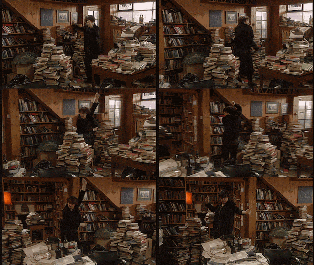 My first piece of work/task that I had to do was the 'One Minute film challenge'. We needed to make a 1minute film, either a remake of a movie or heist. We pared up into groups and then went straight to shooting the film without much planning, well we did have a brief storyboard of what we want but mostly it is just re make. We went out and we were having difficulties of how we should shoot each scenes and what props we needed and where we want to film it. So we left to our improvisation. With my most recent work, 'IDENT' even if there were difficulties we had a clear idea what we wanted, who we want to act for us, the places we would shoot at etc. The theme was Sci-fy thriller and therefore there was a lot of editing and photoshoping scenes and making them 3d, which my friend (George) and I learnt through looking up for tutorials on youtube on CGIs and how to make a HUD. we prepared all the digital scenes on our own time and learnt all these things on our own time way before the project is supposed to start. We research about our theme by using other Sci-fy thriller movies as inspiration, such as 'Ex Machina" and an Ps4 game trailer "Kara" also a game trailer called "Cyber Punk 2077" which we then involved all those ideas into our film opening concept.
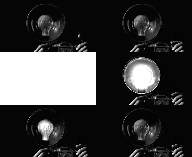 My personal hobby is photography and so therefore I am familiar with cameras and its settings, so I thought that it'll be about the same in how I think about my composition before I take the shot or to take importance of the lighting of my surroundings. I was pretty confident with my camera skills however, moving the camera whilst shooting has become a problem because the film turn out looking shaky. In some scenes then I try to use the tripod but in the end I wan't a fan of it at all. I like to hold the camera myself to be able to move it freely without limitations. So in the end I don't feel like there is any significant difference. Although I have learnt what different shots has a name and that each of them can help to portray to the audience what we want them to know. (e.g. two shot, reaction shot, close up etc.)
 Visual effects -
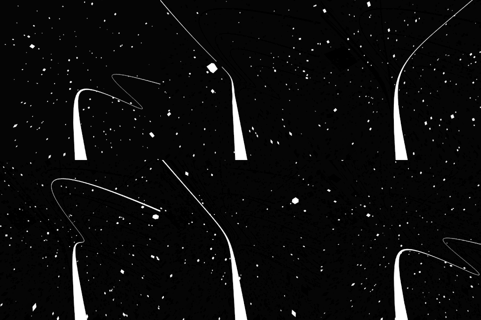 At the beginning I knew nothing about photoshop, knew some basics of after effects and premiere but it was just knowing tools and what its purpose was. Through out the process of making 'IDENT' Sci-fy thriller, I had learnt how to use photoshop easily with the help of my team mate that knew a lot about photoshop already (George). The scene in IDENT where there are empty corridor and city scene are painted by George and I. We spent a lot of time on our own experimenting before we were able to do what we had aimed to do. The eye HUD that I made was also from a tutorial on youtube it shows me steps to how to make a "cyborg" eye using multiple layers and playing around with the tools. Then using Moca AE to motion track the eye, however I don't know why but it didn't seem to work at the time so instead I did it manually. Going frame by frame change the position of the HUD to fit my protagonist eye.
Editing -
Editing is a very tiring and most of the time frustrating when there is technical difficulties and such and such. I was pretty satisfied with my first project that I edited, one minute film challenge where I had a pretty good continuity to my shots, the scene where Snow White is given the poison apple and ate it. However, in some scene such as when the witch came into the frame the shots were not the same and therefore when I put the transition edit to it, it makes the footage move and seems like she glitch. Same goes with my psychological/noir thriller which has the same problem as "Mirror Mirror" my one minute film challenge. "IDENT", however didn't have this I have learnt to make my editing smoother and without a lot of distortion if not needed. You can tell it is more stable as in the shots are all clear and not fuzzy. The continuity is still present when the protagonist falls and hits the ground there are two different views, from behind and on the side. There are also the part where she wakes up and then walks out and to the lift where she calls for it. There were many shots from different angels of the scenes and to make it all fit together that she was going downstairs.
Creative confidence - thinking of interesting ideas and making them happen.
In our first few projects I spoke my ideas and thoughts so I was confident to a certain extend about what I'd like to do. Although I didn't really think out of the box and stuck with whatever that is given to me and did what as a group we decided on so that it is safe and we would get grades for it. Furthermore keeping things simple enough so that we don't work ourselves to hard and especially on myself since I usually do the editing and most of the camera work. Those two things certainly takes up a lot of my free time that I had. In my last project my friend showed me this video of "Kara" a Ps4 game trailer, at that point we had a couple of ideas in mind and planned already but once I saw the video I was really excited about it and on the spot I felt that I wanted to try to do animation/CGI something along those line. I immediately told my friend that can we drop all the other ideas and do this? I really wanted to try and learn how to animate and just figuring out how the professional did it in general. So we did some research of different Sci-fy thrillers and their "codes and conventions" so we knew roughly what we should put in so that the audience see it as a Sci-fy thriller not just a thriller. We mixed different ideas from each of the different movies/media and put it together (Ex Machina, Kara, Cyber Punk 2077). This is very ambitious of me that I suggest we should do it, because when I said that my friend thought I was joking and when he learned that I wasn't joking he was even more startled. I knew it was because if we didn't succeed it would be risky for us to start on a new project in the middle of the way or even worst near the end. Therefore we needed to plan carefully and well so that our plans are solid and we knew exactly what to do.
Tuesday, 23 February 2016
Monday, 1 February 2016
Didn't go as planned/ Rough Cut 2
 When the day of the deadline comes closer and closer we realized that our actor is always busy and therefore, we had a huge delay on taking footages. At the end on sunday we decided to change our actor and dedicate one whole day to shoot the whole thing with her (Tanya) and a final storyboard is drawn. After it has been shot I spent the whole night editing the effects and animation onto each footage and putting it together. Luckily my team mate and I was able finish off the animation in time and
 was able to get it done however, I didn't have time to put on the credits because it was a really rushed night so on monday we had the opening although it wS not complete. The plot made sense and the music was coming soon after (made by my other teammate George). Which he also did another version of the background music to fit with the new footage and arrangements. By the end of Monday this is what we got:
The Location was mostly at my house. I put up a white/black wall behind and put on my own lighting using lamps from my room. I personally use this for my art photography and video because I can control the lighting therefore, I thought it was a good idea to use this space to shoot the close up of the eyes scene. The lift and the kitchen was also in my house, luckily in my house there was a lift since we have many floors and our kitchen is on the 3rd floor. Which the lift and the atmosphere of my house fits the Sci-fi theme therefore, as a team we decided on setting the location here.
The running scenes and the shooting scene as a long shot was taken at the back of a village called
Hyde Park, because at the back there was this empty road and waste land. Although because the walkway was surrounded with grass I needed to mask it using After effects to darken the surroundings.
Wednesday, 27 January 2016
Tuesday, 26 January 2016
1st Rough cut & FEEDBACK
-Quite random (plot/scenes)
 -Storyline?
-Confused weather we are doing the shots as reality or animation
After we all sent in the rough cut for our opening the class feedback on each of the videos.
The class said that it didn't make any sense therefore, its pretty confusing weather what the main character is or what is happening. There was no plot. It seems like there was no story line to it. Also, it wasn't clear if it is an animation or reality because we didn't really mix it and it is completely separated from each other.
RESPOND to feedback
-Eye scene first then titles
-Add more animation to the real footage (at least 1/4)
-Something to do with the flashback that makes her in the position she is
Start with normal footage and add animation little by little
So we decided instead of having the animated photoshop we would start with the close up of an eye first. So basically it will start looking normal and then as it progress throughout the opening there will be more animation to it. Either we do that or throughout the whole thing there will be a consistent amount of animation. Also, I decided to make a new storyboard which is more detailed and precise on what shots we need and at what angle. In different scene we'll make sure that it links together in some way so that it doesn't look like a different "story".
Sunday, 24 January 2016
Process of editing/animation Film Opening
During the weekend I started editing our film opening, since we just shot our "real" footage on friday night. This is my first time working with motion tracking and animating in After Effects and so I had no clue. I found a tutorial on youtube on how to edit a cyborg eye. First of, I made layers of null shapes, playing with its width, density and colours. Then I place a keyframe for rotation and size
Monday, 18 January 2016
Shooting Problems
The last weekend I found a toll way that was being built but because the company ran out of money it is not being used. Therefore, I told my team that we should meet up on saturday or friday to shoot the scene where our main character is being chased.
We also need to order a green screen from the art to shoot the scenes where we will mix with our animated backgrounds. However, if we don't get the green screen in time we would probably have to make do with a "white" screen. Although, if we are not able to find that at my house I've had several photo-shoot/video shoot so I could simply create a small white room within my house. In order to do this I do need everyone in my team to be present on the day, since we are in different classes and has a different life schedule in general it is hard to meet up all together the three of us its usually meeting up in pairs. Therefore, I am going to make a strict schedule of time where we need to meet and to get the actor on the days that we need her. Other than that we are doing our own jobs pretty well. George is doing his photoshop scenes and I am also doing some myself to make up the numbers of scenes we need. Au, he is the person who is in charge of getting props and whatever extra things we need to help the process of the work.
We also need to order a green screen from the art to shoot the scenes where we will mix with our animated backgrounds. However, if we don't get the green screen in time we would probably have to make do with a "white" screen. Although, if we are not able to find that at my house I've had several photo-shoot/video shoot so I could simply create a small white room within my house. In order to do this I do need everyone in my team to be present on the day, since we are in different classes and has a different life schedule in general it is hard to meet up all together the three of us its usually meeting up in pairs. Therefore, I am going to make a strict schedule of time where we need to meet and to get the actor on the days that we need her. Other than that we are doing our own jobs pretty well. George is doing his photoshop scenes and I am also doing some myself to make up the numbers of scenes we need. Au, he is the person who is in charge of getting props and whatever extra things we need to help the process of the work.
Sunday, 17 January 2016
Process Of Photoshop (DEMO) Film Opening Planning
George and I were experimenting with photoshop, since both of us choose Art for a levels too we apply what we know the the photoshop of the different scene from our imagination. These final paintings are put together by photos of building and maybe just a picture that is close to what we want, therefore to make it ours original I paint over it myself and changes the scene and the atmosphere completely.
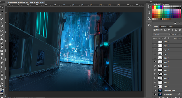

After the photoshopping is done, we then make the picture into a 3d platform before opening it up in After Effect. Using the camera tool we play with what angles the camera will be set at and where it would move to by the end of the scene. One of the scenes, it'll be raining and we found out that there is an effect were you can make rain or another where water droplets can be sliding down your "camera lens" in our final draft we would definately use both of those effect together to make it even more realistic.
Subscribe to:
Comments (Atom)


